The SEO and AI search agency for e-commerce brands.
repstack
WEB DEVELOPMENT · UX/UI · CONVERSION
From Information Overload to a Clearer Growth Experience.
How Tabula transformed Repstack’s website into a clearer, more structured digital experience built to communicate its value, simplify service discovery, and drive action.
STRATEGY · UX/UI · WEB DEVELOPMENT
THE PROJECT
A better service deserved a clearer way to be understood.
Repstack helps agencies scale with pre-trained virtual assistants across marketing, operations, sales, and customer support.
They had the expertise, the talent network, and a strong service offering. The challenge was turning all of that into a website that was easier to understand, easier to navigate, and built to convert more visitors into enquiries.
CLIENT
Repstack
INDUSTRY
Virtual Assistants
Agency Services
SCOPE
Strategy ·
UX/UI
Web Development
FOCUS
Positioning Information Architecture Conversion
PLATFORM
WordPress
APPROACH
Strategy → UX → Design → Development
THE CHALLENGE
The expertise was there. The experience needed structure.
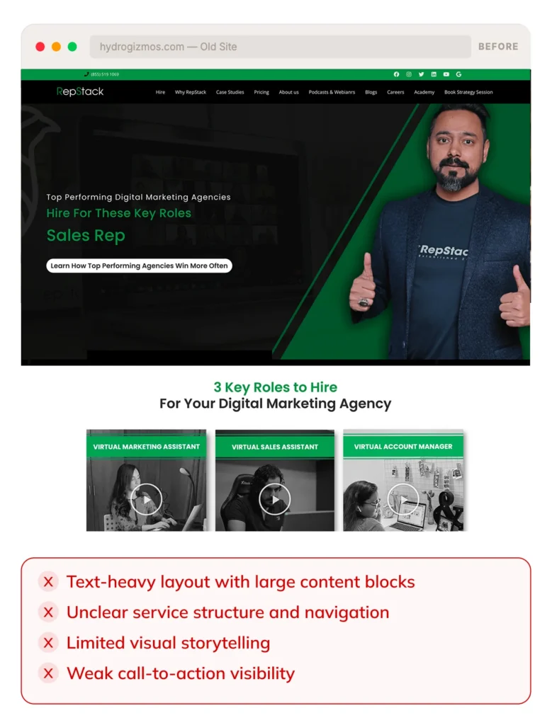
Repstack had a strong service offering, a broad range of virtual assistant roles, and a clear value proposition. But the existing website made it difficult for visitors to quickly understand what they offered, who it was for, and what to do next.
The experience felt cluttered, text-heavy, and lacked the visual structure needed to communicate the value of their services and build confidence with potential clients.
The opportunity wasn’t another redesign.
It was to build a digital experience where every interaction worked harder
TOO MUCH INFORMATION
Large amounts of content made the experience harder to scan and understand quickly.
WEAK CONTENT HIERARCHY
Important messages, services, and conversion points didn’t receive enough visual emphasis.
LIMITED VISUAL STORYTELLING
The previous experience relied heavily on text, leaving fewer opportunities to show the people and value behind the service.
UNCLEAR USER JOURNEY
Visitors needed a clearer path from understanding Repstack to exploring its services and taking action.
THE TABULA APPROACH
We didn’t start with pixels. We started with the problem.
Before redesigning the interface, we redesigned the way the experience worked.
Repstack’s website needed more than a visual refresh. We approached it as a complete digital experience, looking at the positioning, information architecture, service structure, customer journey, and conversion path before defining the new interface. We then connected those pieces into one clearer experience, making the business easier to understand and the next step easier to take.
AUDIT
We reviewed the existing website to identify the content, UX, hierarchy, and conversion friction holding the experience back.
STRUCTURE
We reorganized Repstack’s information around how visitors need to understand the business, services, and virtual assistant offering.
EXPERIENCE
We created a clearer journey from understanding Repstack to exploring its services, building trust, and taking action.
DESIGN
We introduced stronger visual hierarchy, imagery, cards, spacing, and interaction patterns to make complex information easier to consume.
BUILD
We translated the new system into a responsive website designed to deliver a consistent experience across desktop and mobile.
THE TRANSFORMATION
Same products. Completely different experience.
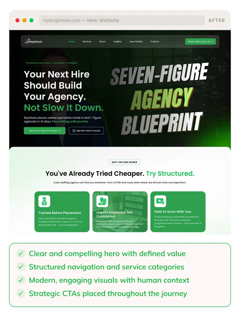
The redesign wasn’t about adding more. It was about removing the noise and giving the right things more attention.
A clearer hierarchy. Stronger imagery. More intentional spacing. Better product storytelling. And a simpler path to purchase.
CLEARER POSITIONING
Communicate value faster and more effectively.
BETTER SERVICE DISCOVERY
Easier to explore roles and services.
MORE ENGAGEMENT
A stronger and more modern brand experience.
STRONGER CONVERSIONS
More opportunities for visitors to take action.
WHAT CHANGED
Every part of the experience was given a job.
We rethought the Repstack website from top to bottom — and every element was designed with a purpose.
CLEARER SERVICE STRUCTURE
Services and virtual assistant roles are now easier to browse, understand, and explore.
STRONGER
STORYTELLING
We introduced real people, use cases, and outcomes to communicate the value behind Repstack’s services.
CONVERSION
FOCUSED DESIGN
Strategic CTAs and streamlined journeys make it easier for visitors to take the next step.
MODERN VISUAL
IDENTITY
A cleaner, more modern design creates a professional and trustworthy brand presence.
MOBILE-FIRST
THINKING
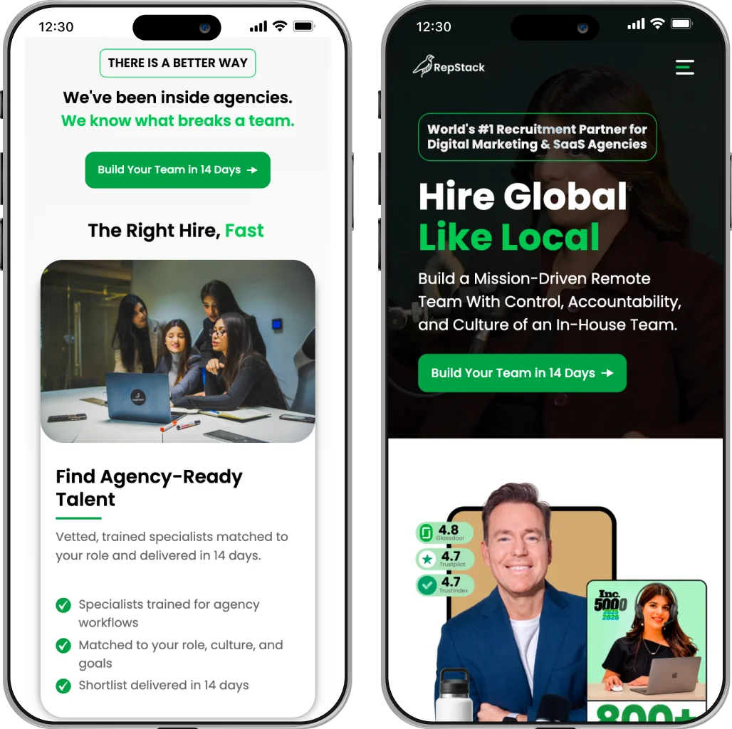
Fully responsive design ensures a seamless experience across all devices, especially for busy agency owners.
A SCALABLE
FOUNDATION
A flexible and organized structure makes it easier to add new services, content, and features as Repstack grows.
home page
product page
mobile experience
THE RESULTS
A clearer experience. A stronger foundation.
The redesigned website made Repstack easier to understand, easier to explore, and easier to act on. By combining a clearer structure with a modern visual approach, we created a digital experience that better communicates their value and helps more agencies take the next step.
CLEARER BRAND POSITIONING
A more focused message that communicates the value of Repstack to the right audience.
BETTER SERVICE DISCOVERY
Services and virtual assistant roles are now easier to explore, understand, and compare.
STRONGER USER JOURNEY
A clearer navigation and a more intuitive experience helps visitors find what they need and take action.
SCALABLE FOUNDATION
A flexible structure ready to support new services, content, and future growth.
THE IMPACT
A clearer experience. A stronger foundation.
The redesign brought Repstack’s positioning, services, content, and conversion journey into one cohesive digital experience — making the business easier to understand and the next step easier to take.
POSITIONING
A clearer first impression
The new experience communicates Repstack’s core value proposition faster, helping visitors understand what the business does and who it serves.
Clearer value communication
SERVICE DISCOVERY
Easier to explore
Virtual assistant roles and services are organized into clearer content groups, making the breadth of the offering easier to browse and understand.
Simplified service discovery
USER EXPERIENCE
A more intentional journey
Navigation, content hierarchy, social proof, and calls to action work together to create a more structured path from discovery to enquiry.
Stronger conversion foundation
DESIGN SYSTEM
Built to scale
A flexible component and content structure gives Repstack a stronger foundation for adding new services, content, and experiences over time.
Ready for future growth
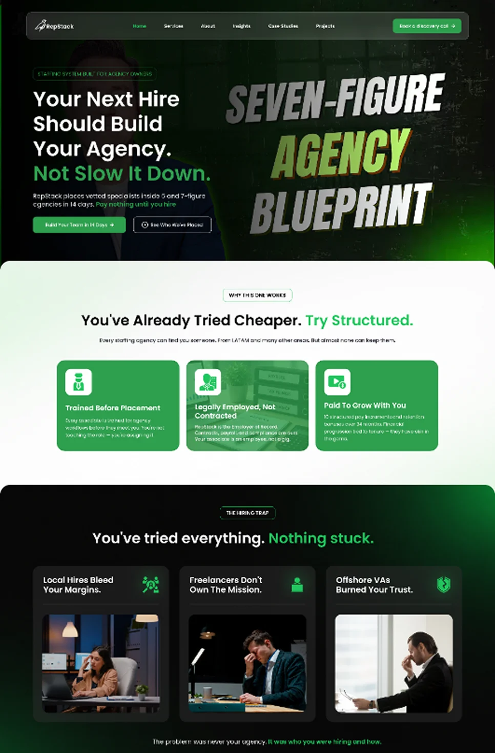
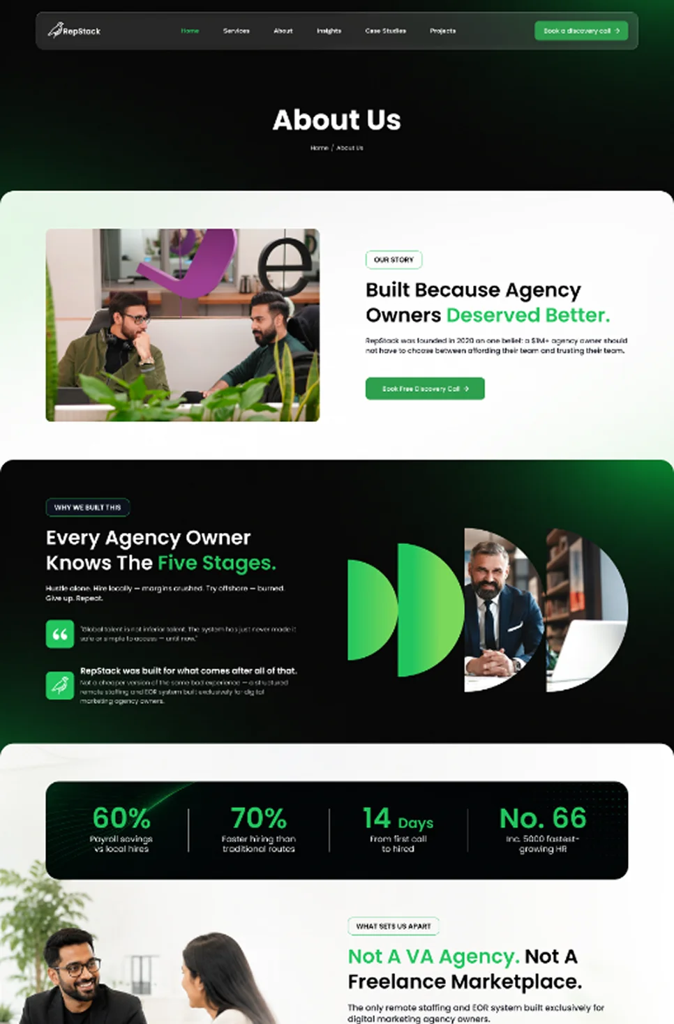
THE NEW REPSTACK HOMEPAGE
A stronger first impression
Built around clarity, visual storytelling, and action.
Use a cropped screenshot of the new Repstack homepage on the right side.
Clearer positioning · Stronger visual hierarchy
THE NEW SERVICE EXPERIENCE
A structured way to explore
Repstack’s virtual assistant roles and understand where each service fits. Use a cropped screenshot of the Virtual Assistant Roles / Services section.
Easier discovery · Better information structure
BUILT FOR SEARCH
A better website is only half the job. It also needs to be found.
Alongside the redesign, we built Repstack’s website with a stronger technical and SEO foundation — helping search engines understand the site, improving discoverability, and creating a structure that can grow with the business.
SEARCH-READY ARCHITECTURE
A URL structure built around search intent.
We researched relevant keywords and structured the website architecture around clear, descriptive URLs that make the content easier to understand and navigate.
SCALABLE CONTENT STRUCTURE
Built to grow beyond the launch.
We developed reusable industry and case-study page structures that Repstack can duplicate as new markets, services, and success stories are added.
ON-PAGE SEO
Every page has a purpose in search.
We optimized page titles, meta descriptions, headings, image alt text, and other on-page elements around relevant search terms.
TECHNICAL SEO
The foundation behind the experience.
We implemented schema markup, canonical URLs, robots.txt configuration, and other technical SEO essentials to help search engines crawl and interpret the website correctly.
SEARCH ENGINE SUBMISSION
Connected to the tools that matter.
We submitted and configured the website’s sitemap through Google Search Console and Bing Webmaster Tools, giving Repstack the infrastructure needed to monitor search visibility and indexing.
PERFORMANCE + MOBILE
Built for people and search engines.
We optimized image formats and file sizes, implemented performance and security tooling, and ensured the experience works across desktop, tablet, and mobile.
DESIGN GETS ATTENTION. SEARCH MAKES THE EXPERIENCE DISCOVERABLE.